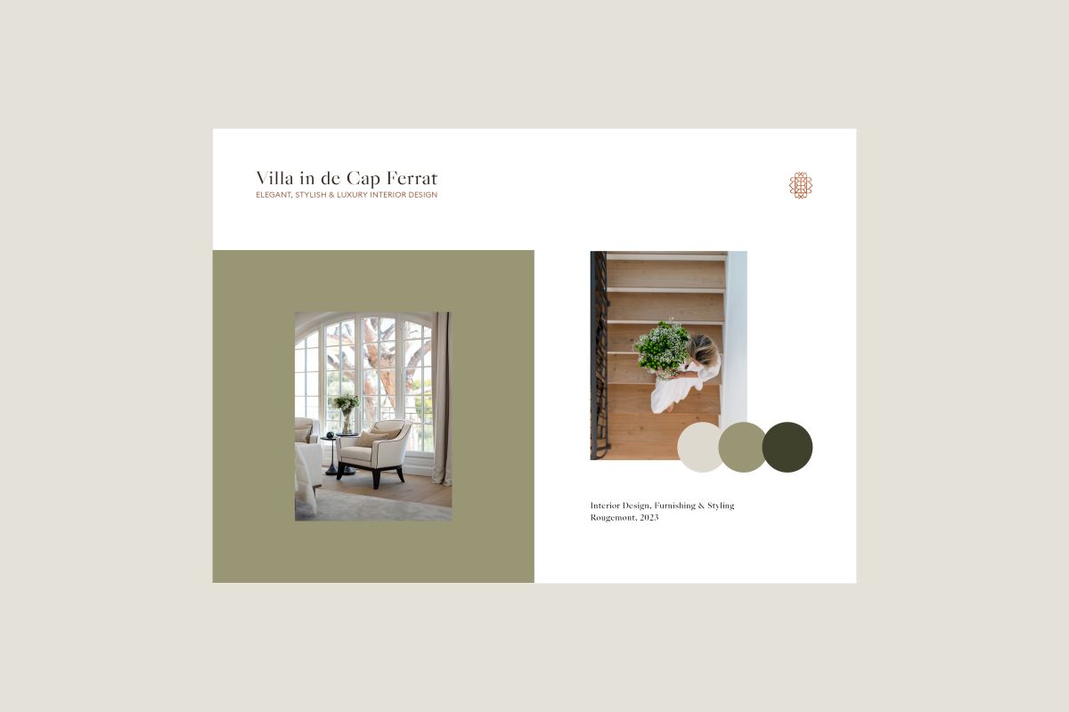
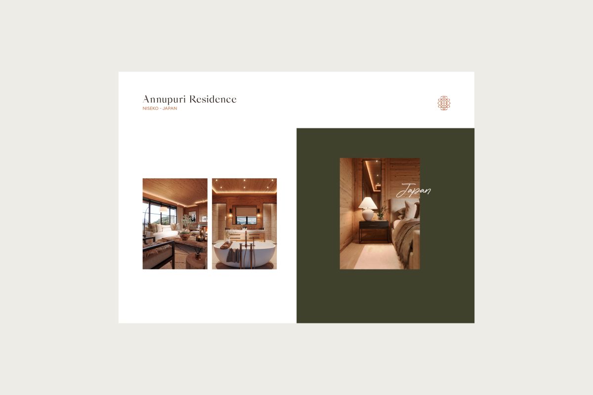
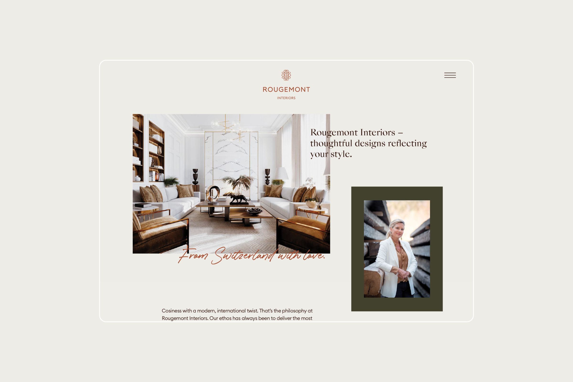
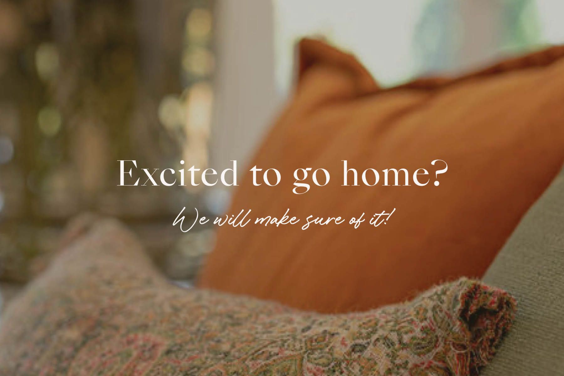
Cosiness with a modern, international twist. That’s the philosophy of Rougemont Interiors. The new brand appearance aims for the detail-focused, elegant, and timeless design.
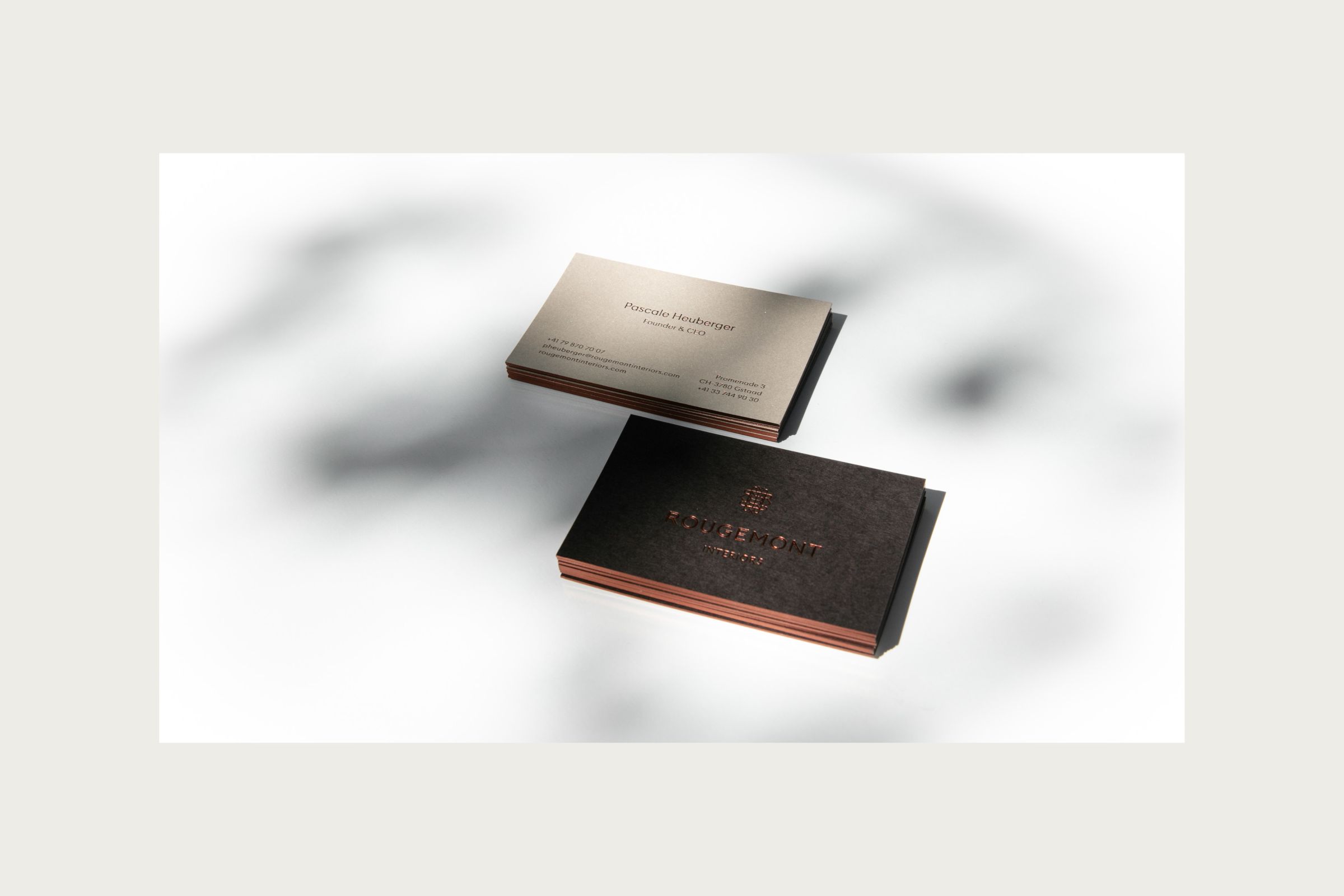
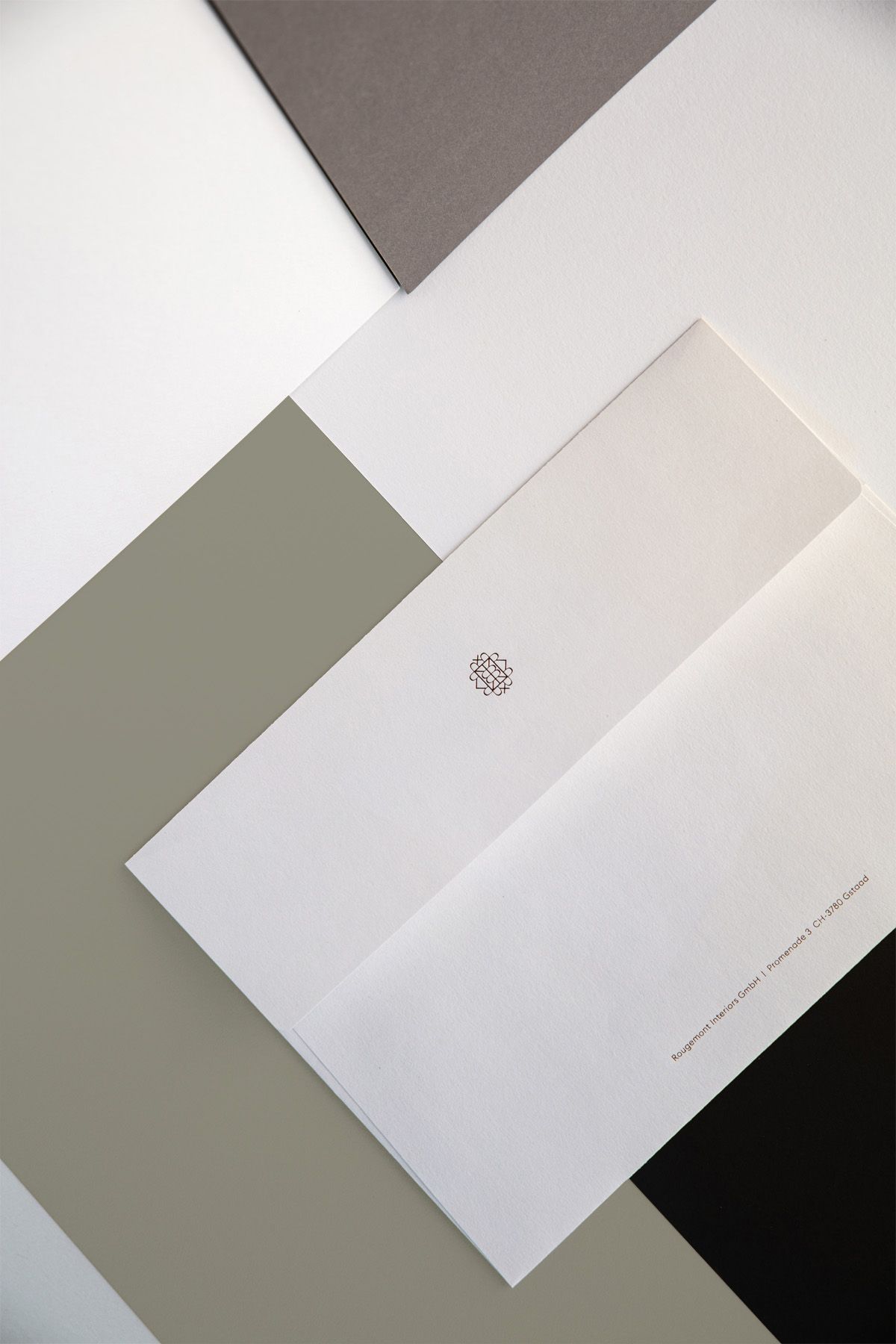
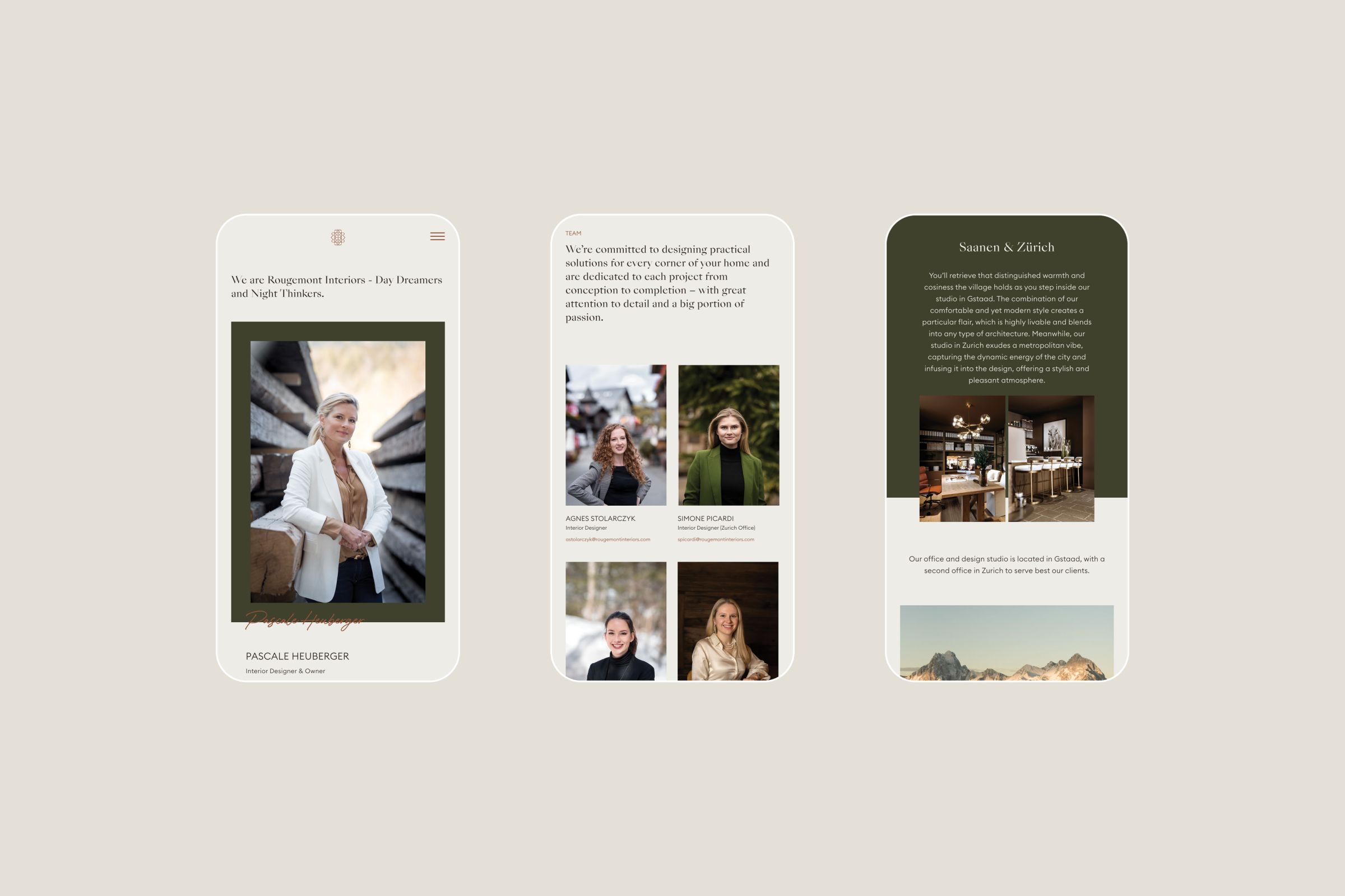
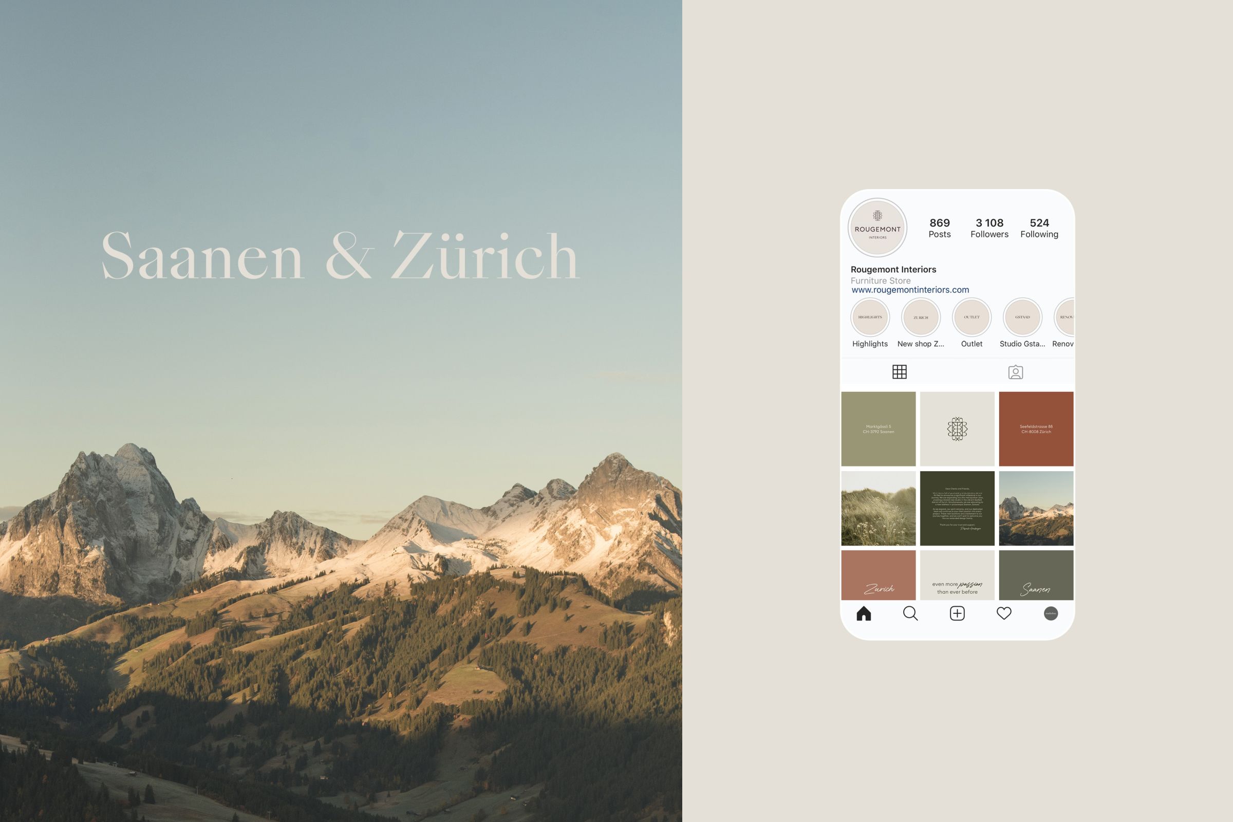
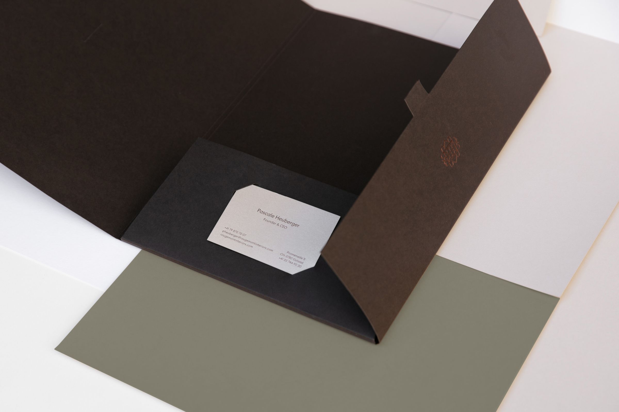
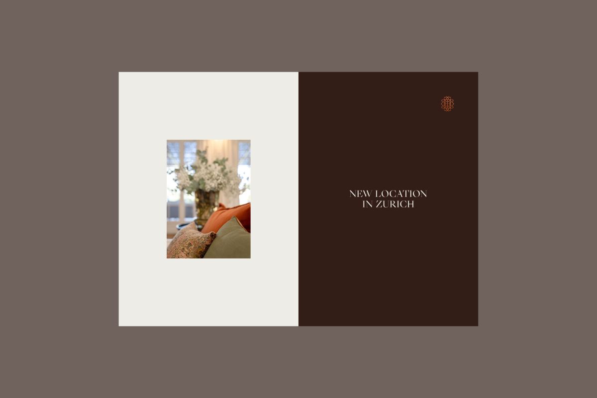
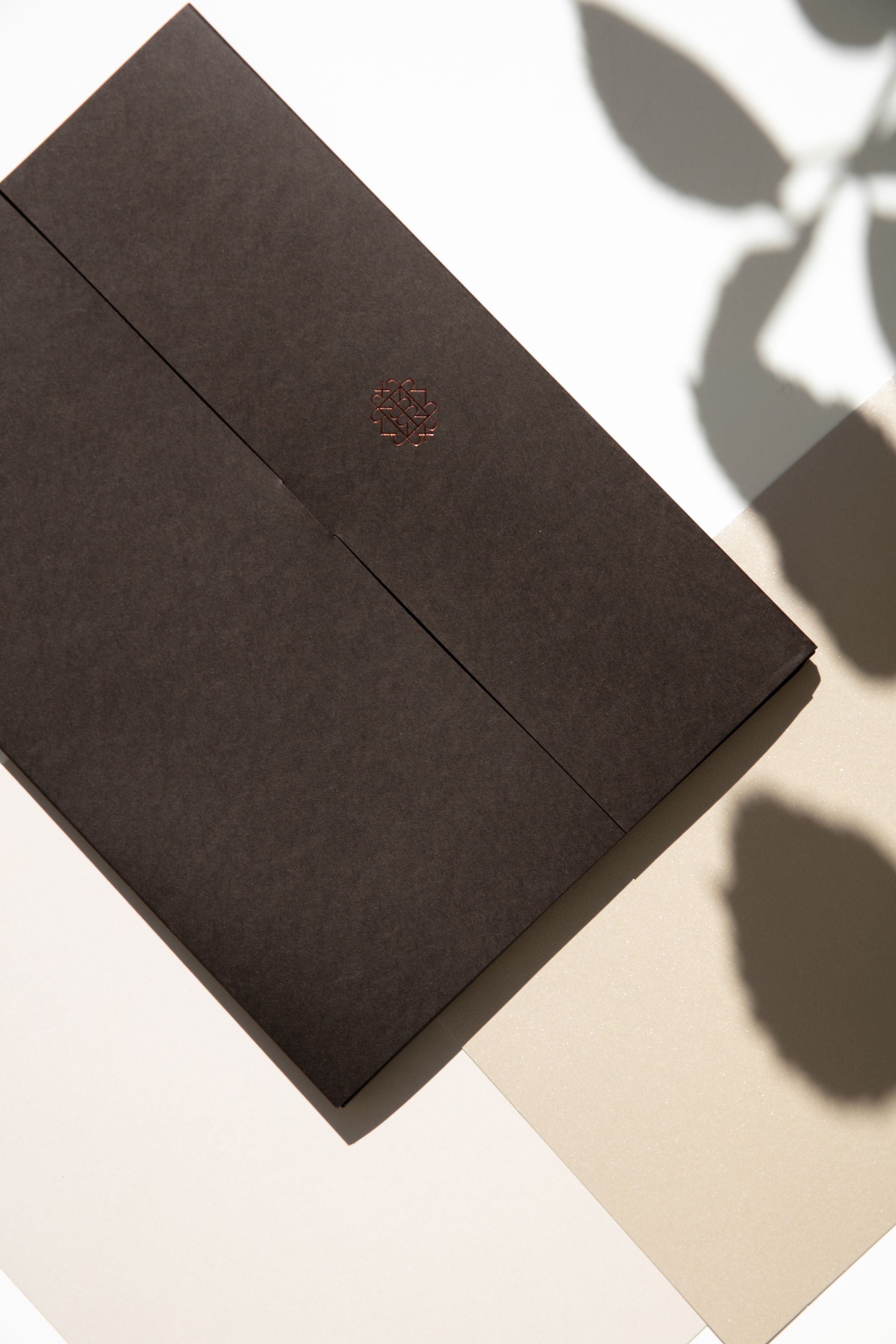
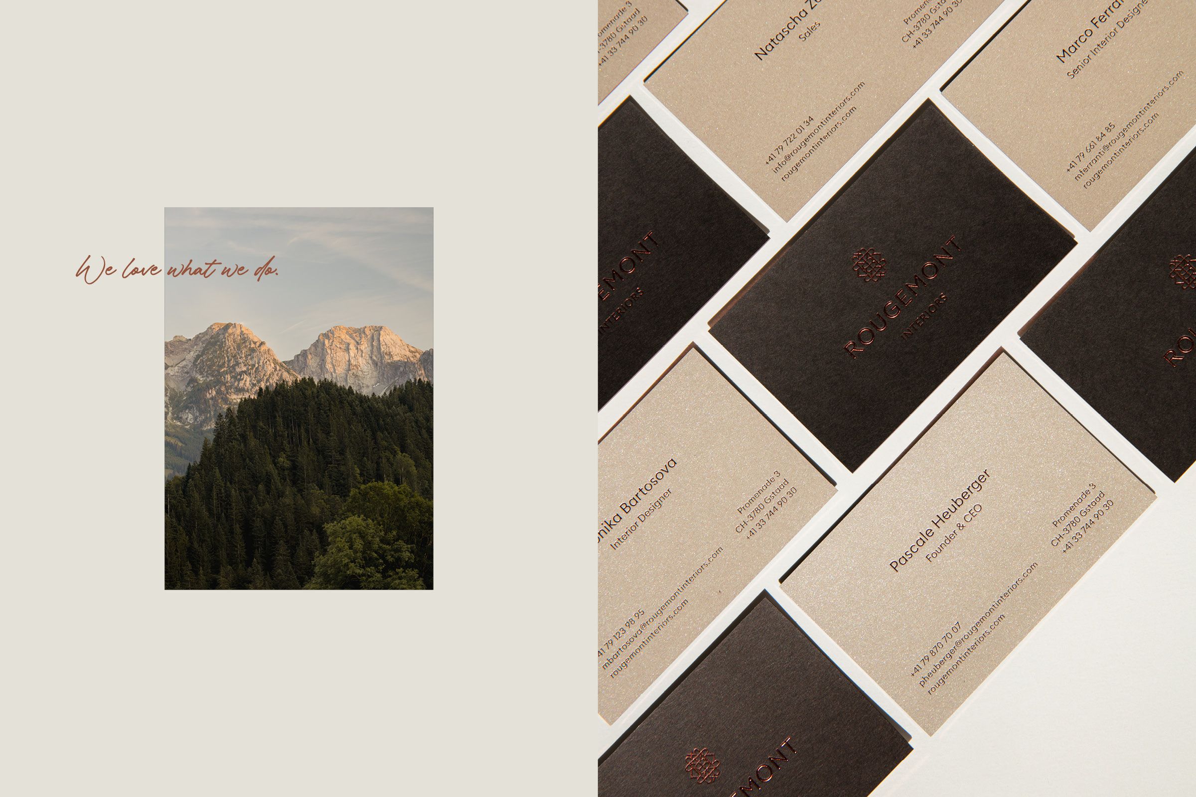
The outstanding icon, created out of the letter R, reminds of a keyhole as a symbol of the turnkey solutions that Rougemont provides. A combination of warm colours together with the unique finishing printing touches and various high-quality papers used across all print materials represent the top quality and luxurious service of the well-known Studio in Saanen (Gstaad). Recently Rougemont Interiors expanded into the metropolitan area and opened a brand-new studio in the vibrant Seefeld district of Zurich. The warm and detail-oriented web design is based on an amazing photo concept and well-selected typography which emphasizes the visitor's experience. The re-design includes as well a new social media strategy and communication concept.
2020
Rougemont Interiors GmbH
Gstaad
Brand Identity & Digital Design

"The outstanding icon, created out of the letter R, reminds of a keyhole as a symbol of the turnkey solutions that Rougemont provides."