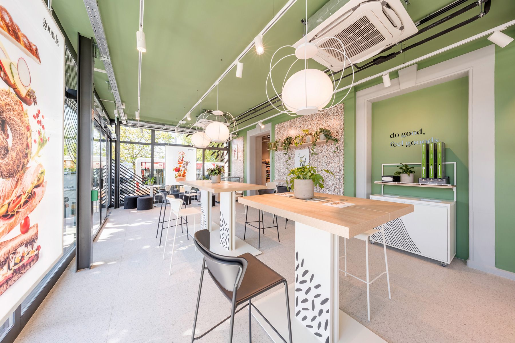
The second location in Winterthur
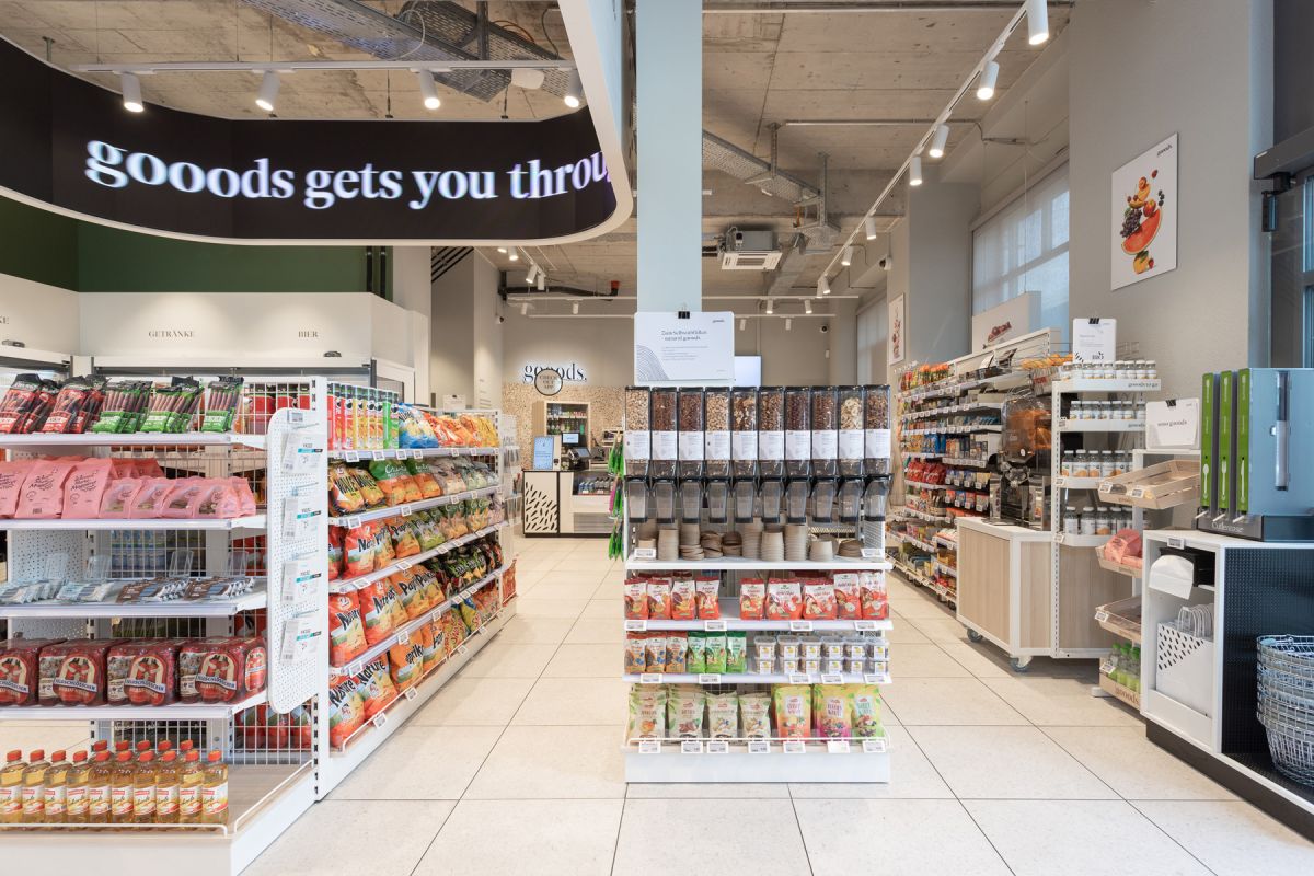
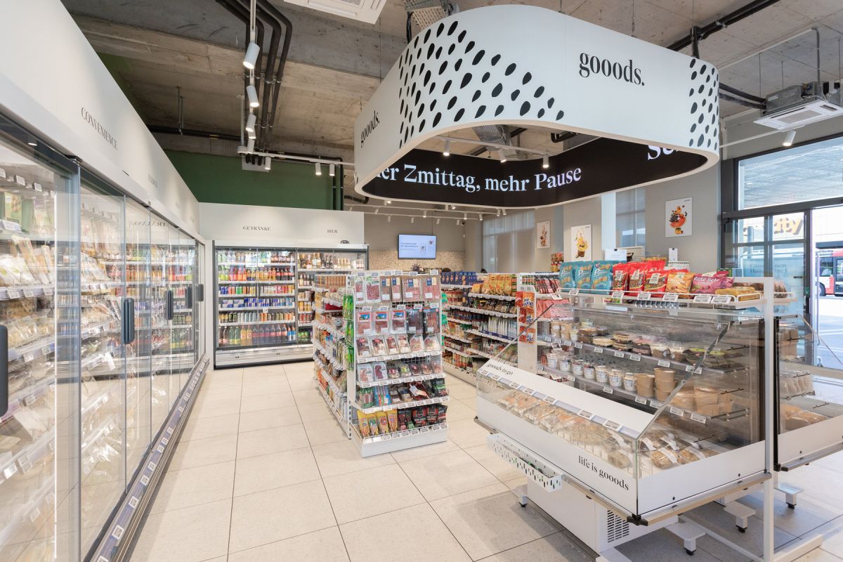
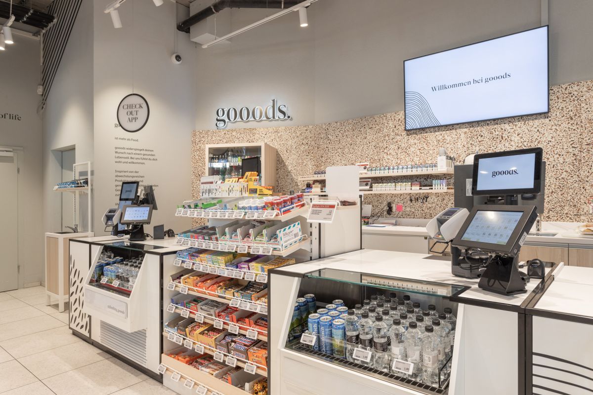
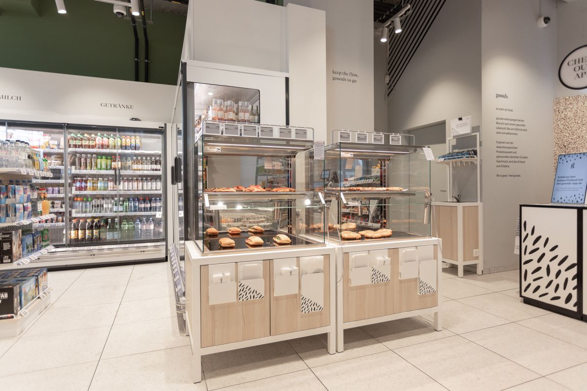
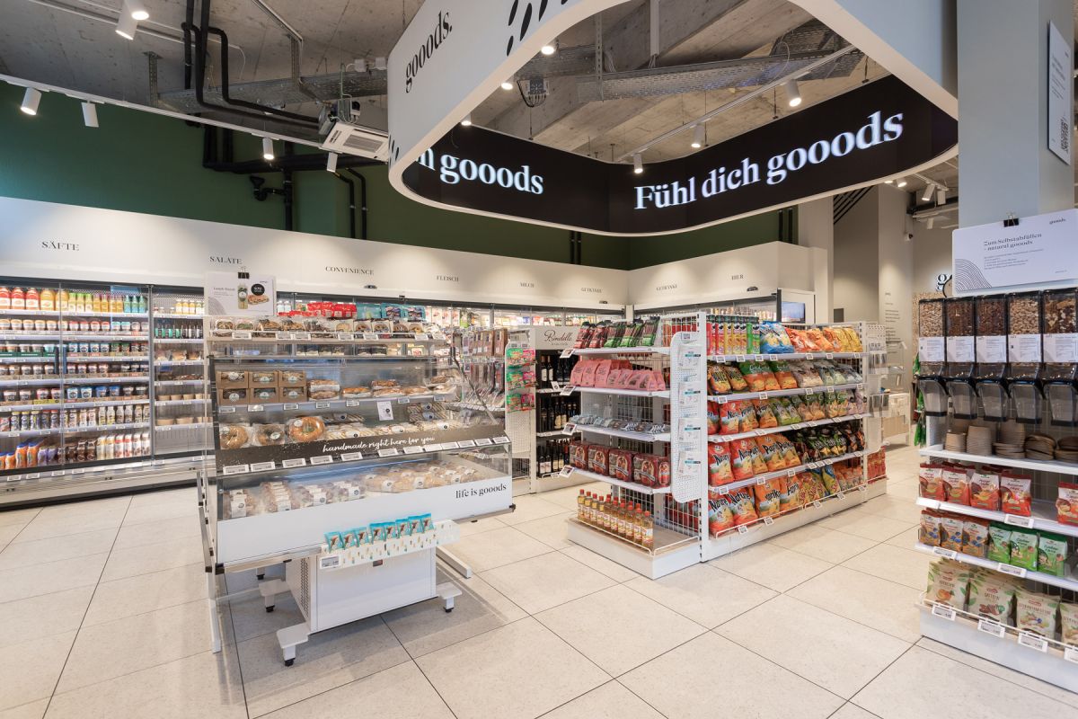
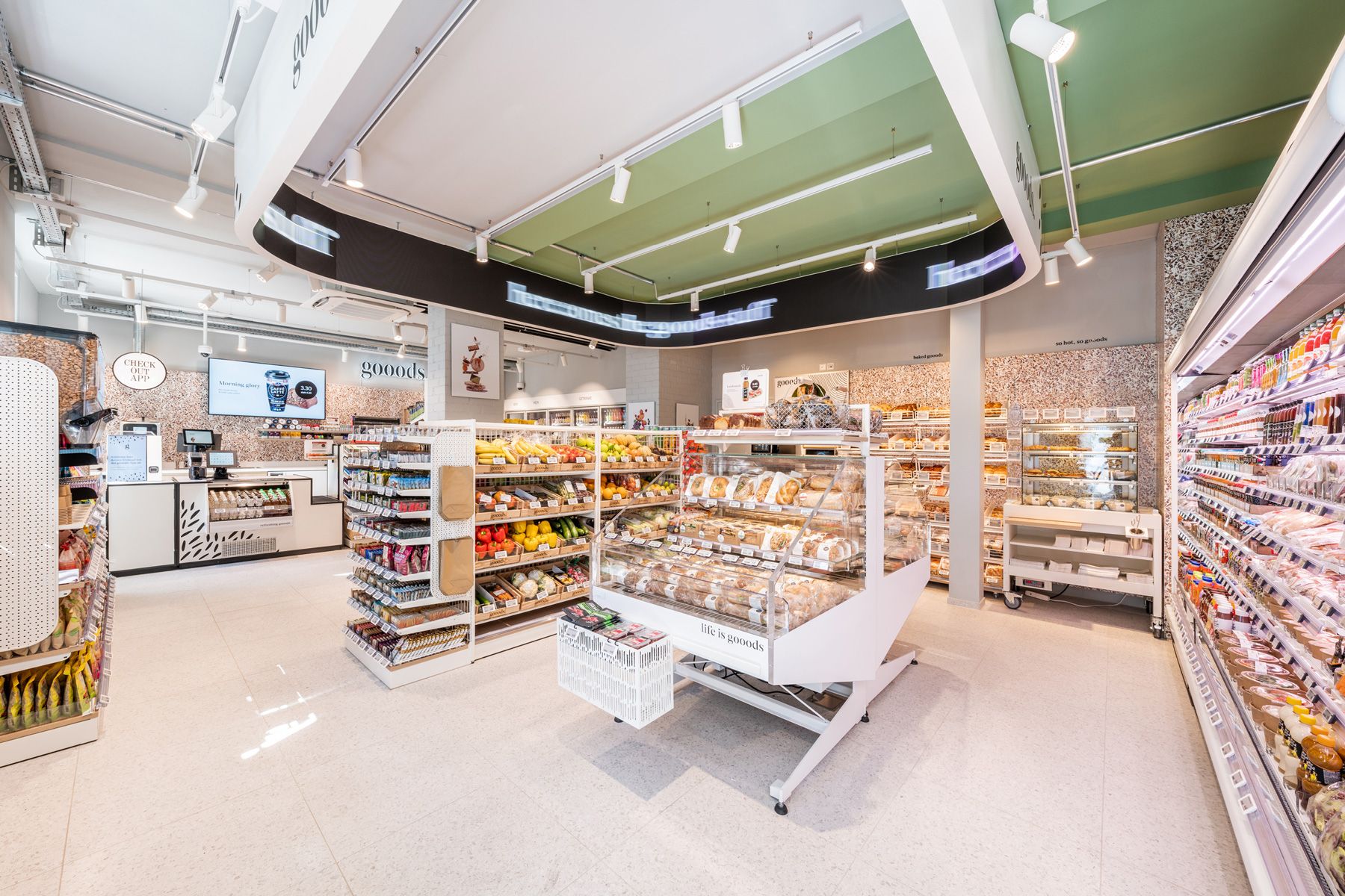
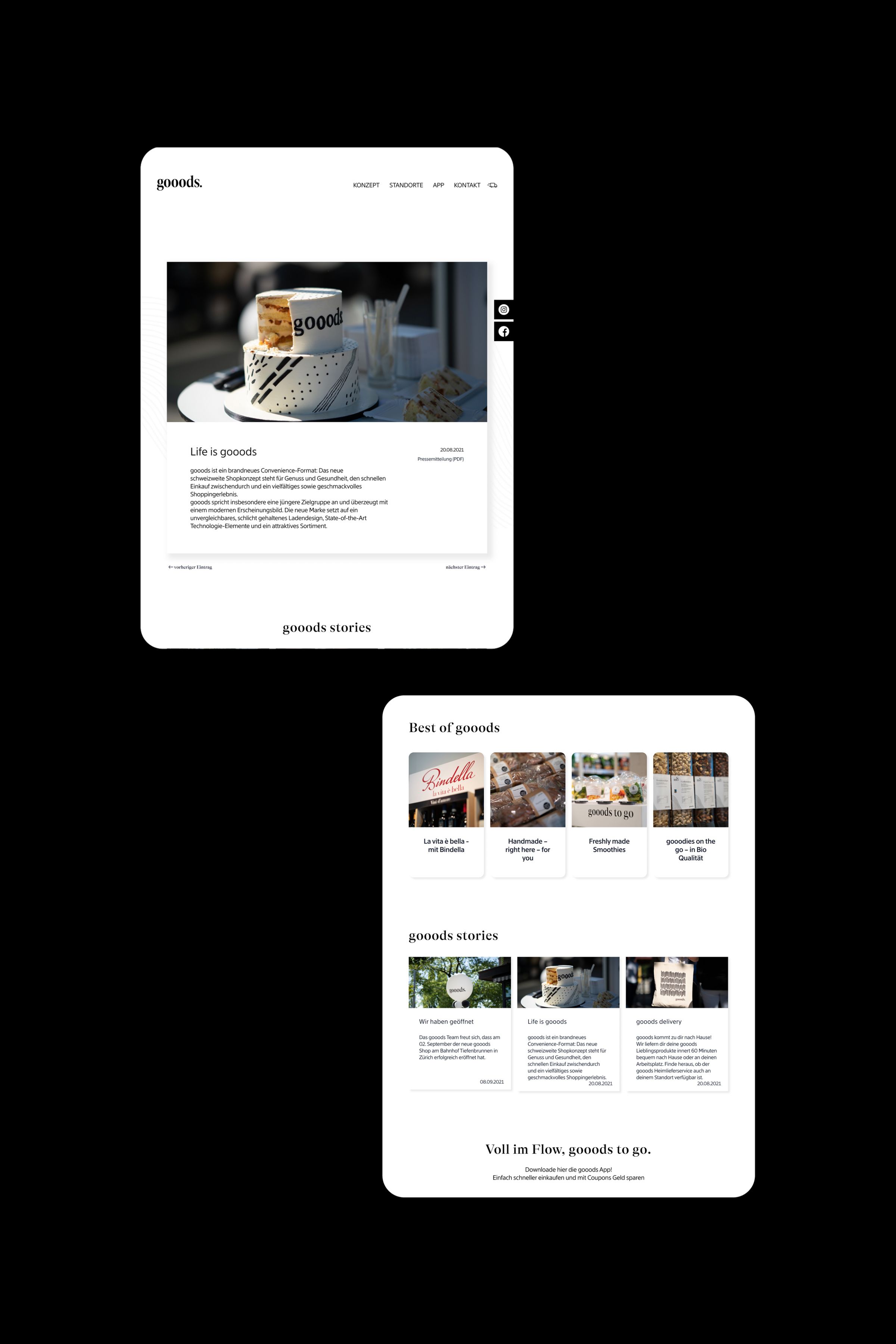
gooods is a new convenience store concept with a wide selection of fresh and healthy products. It stands for enjoyment and health, quick shopping in between and a varied and tasteful shopping experience.
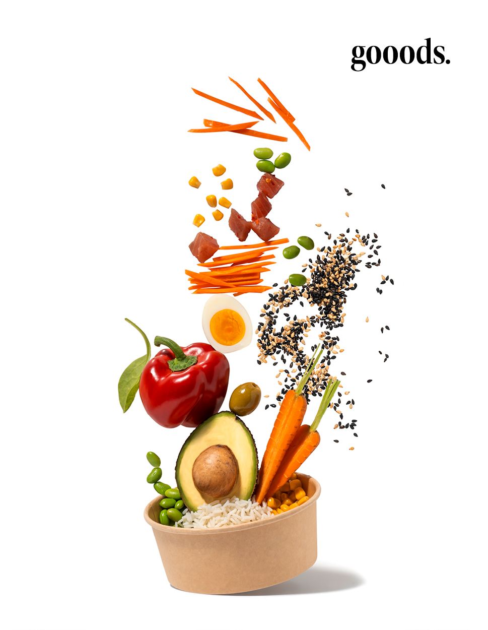
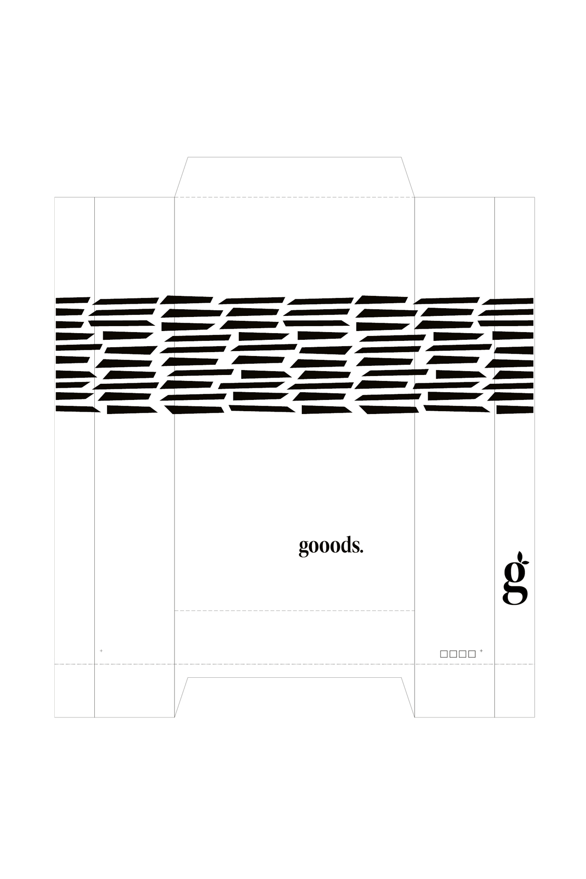
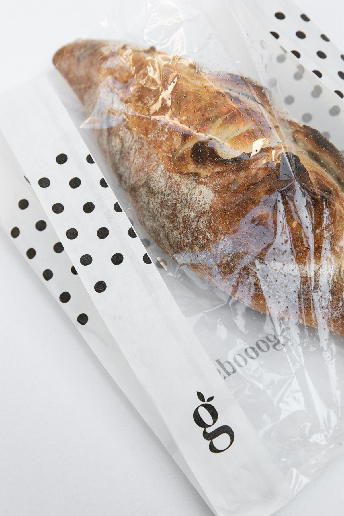
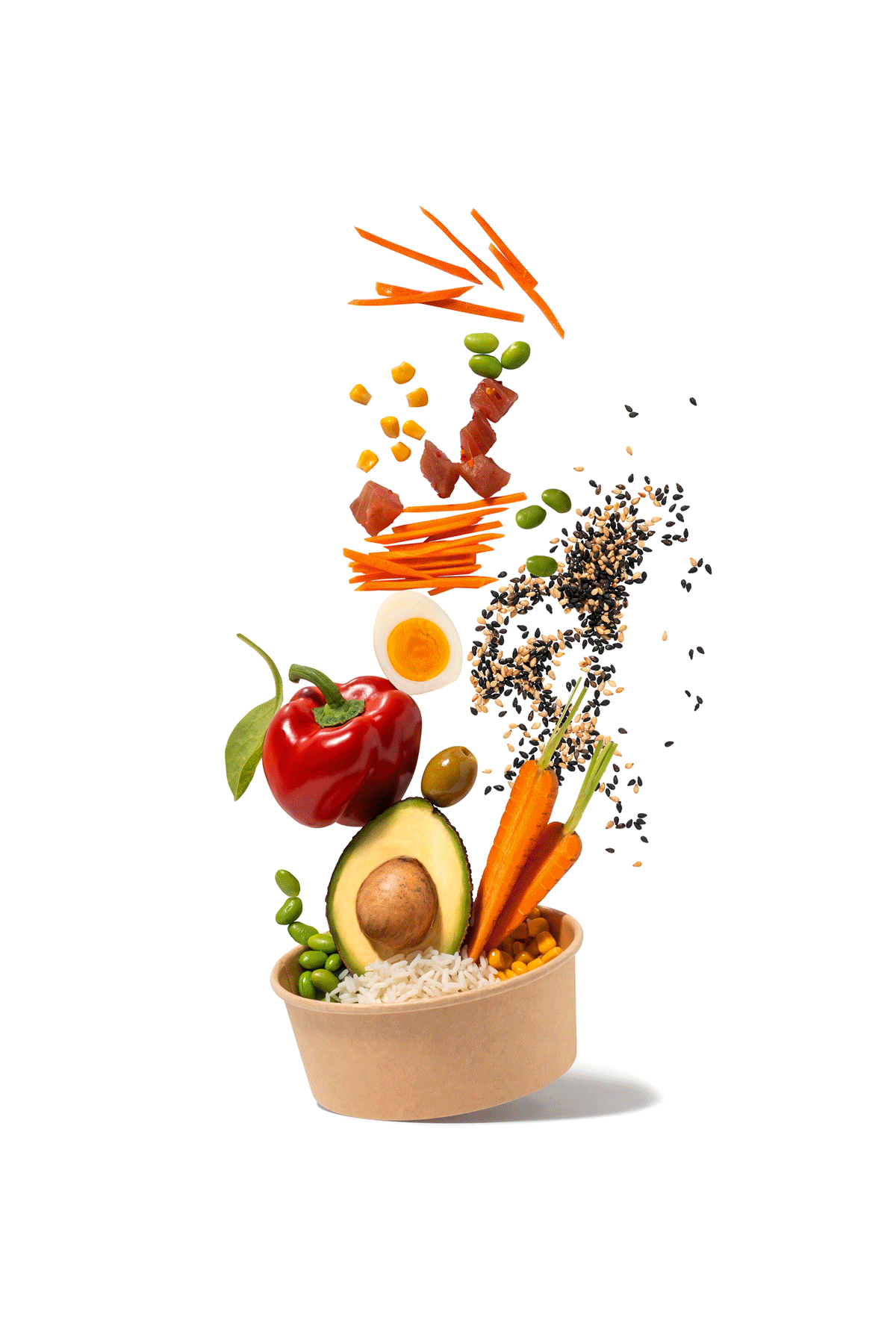
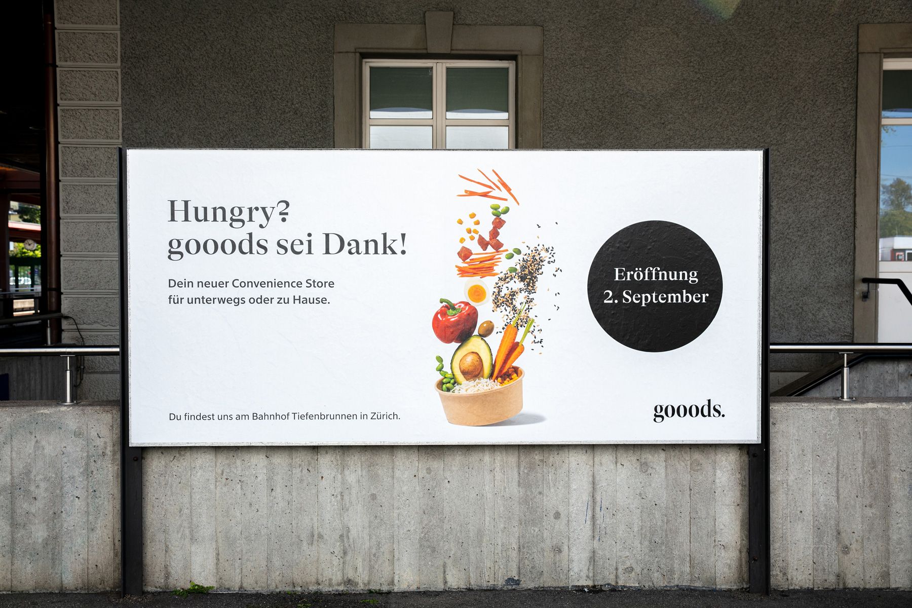
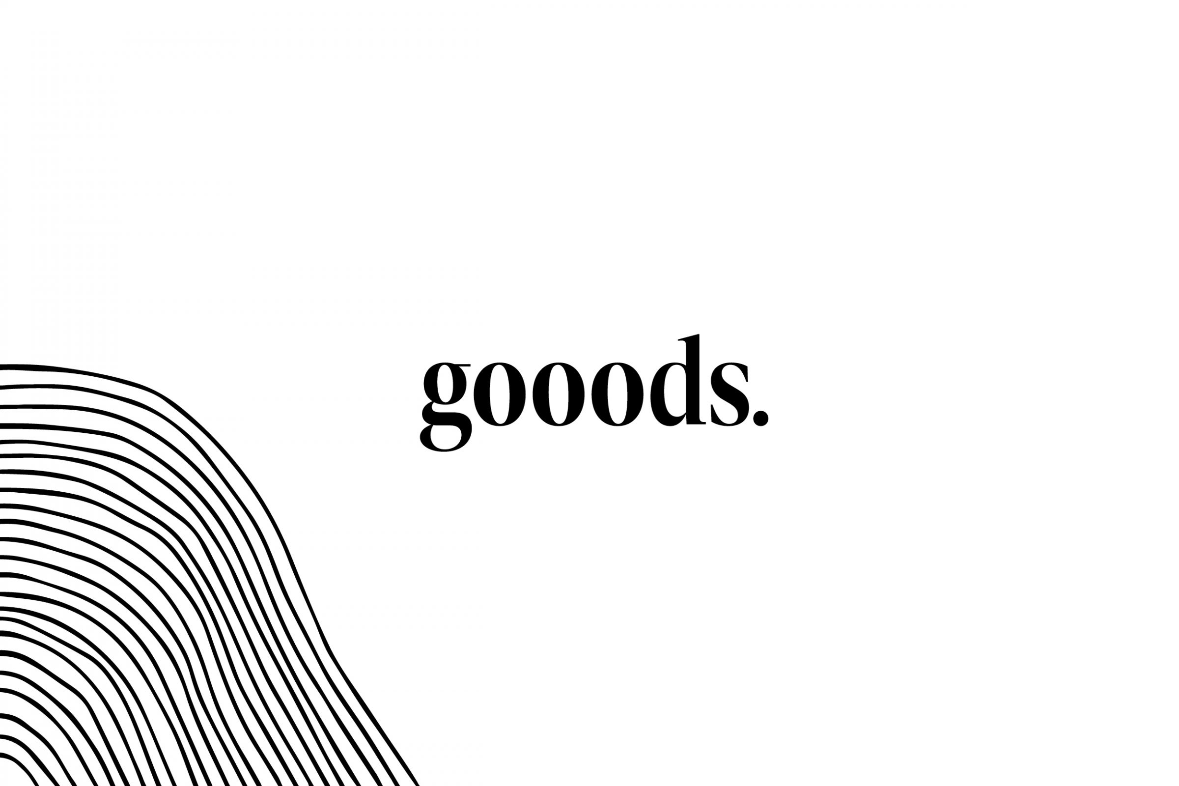
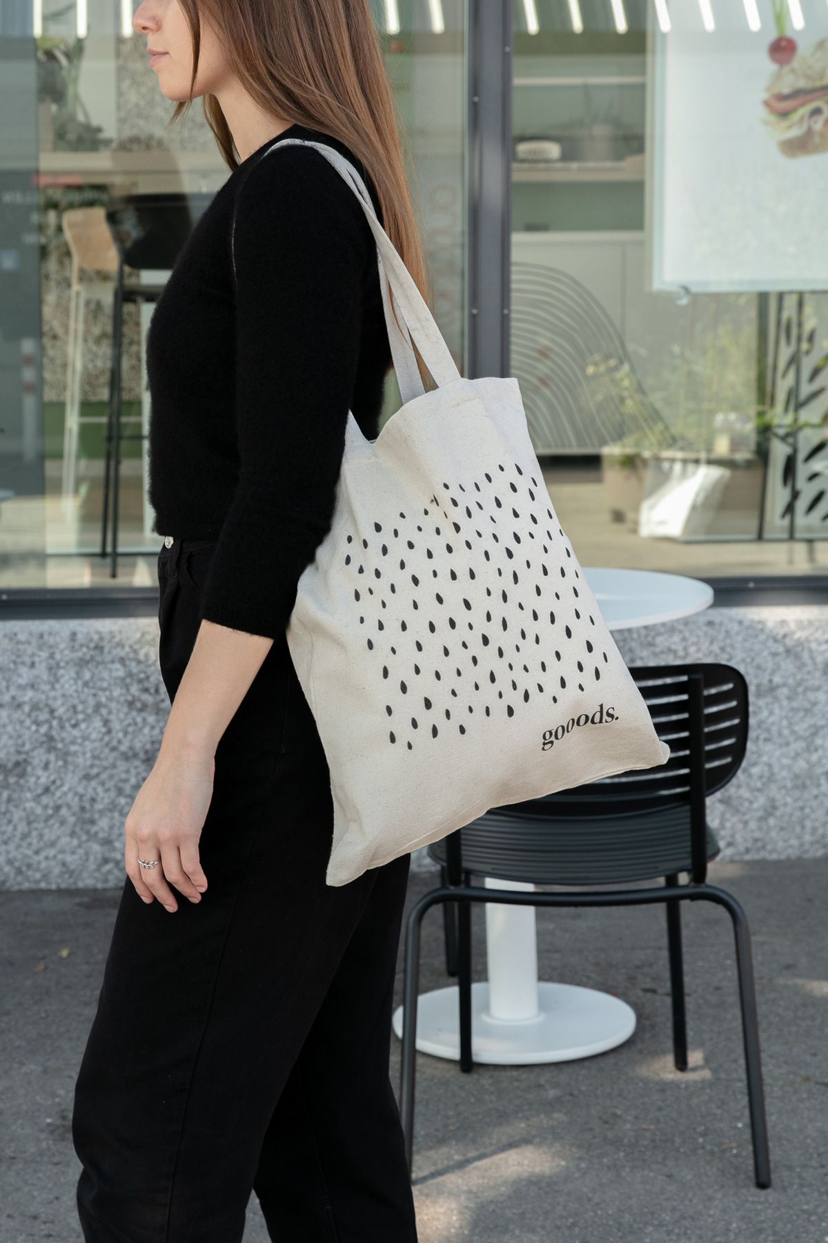
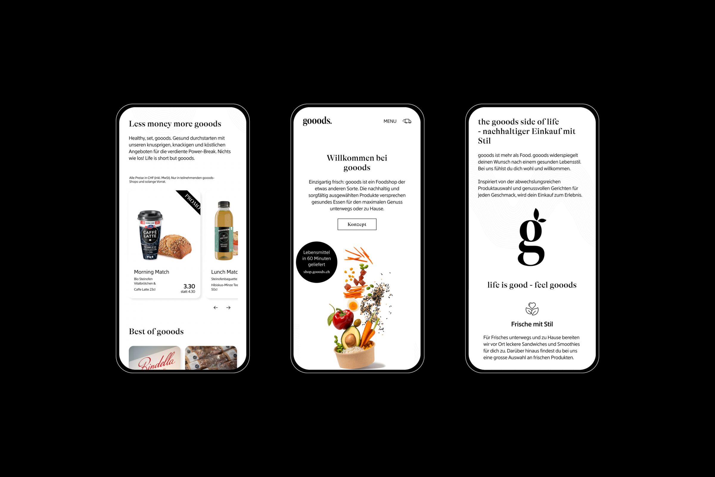
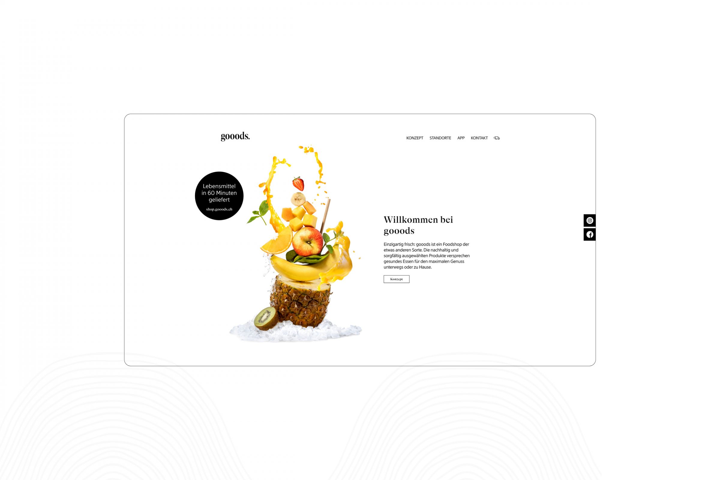
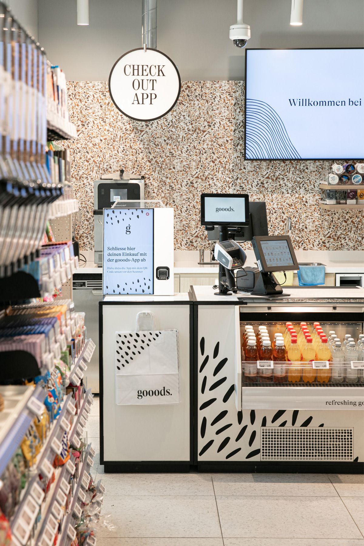
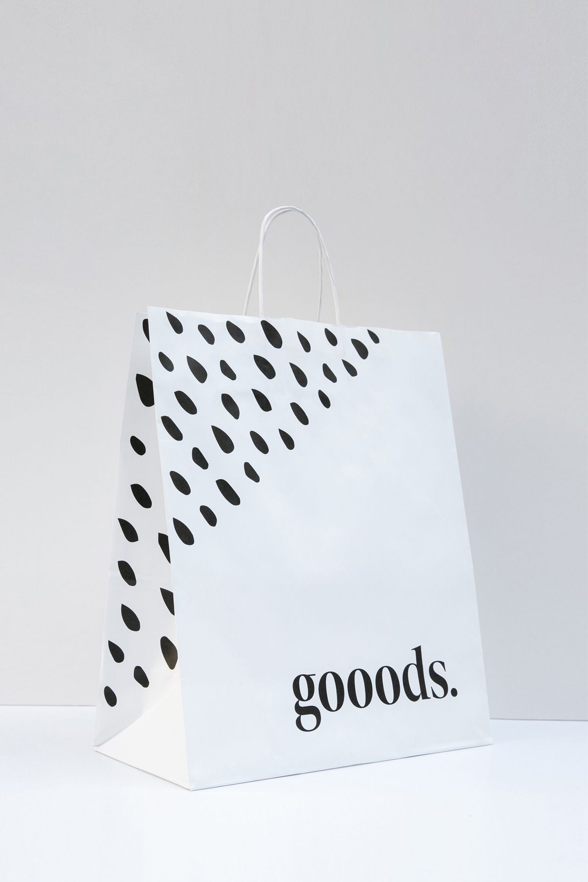
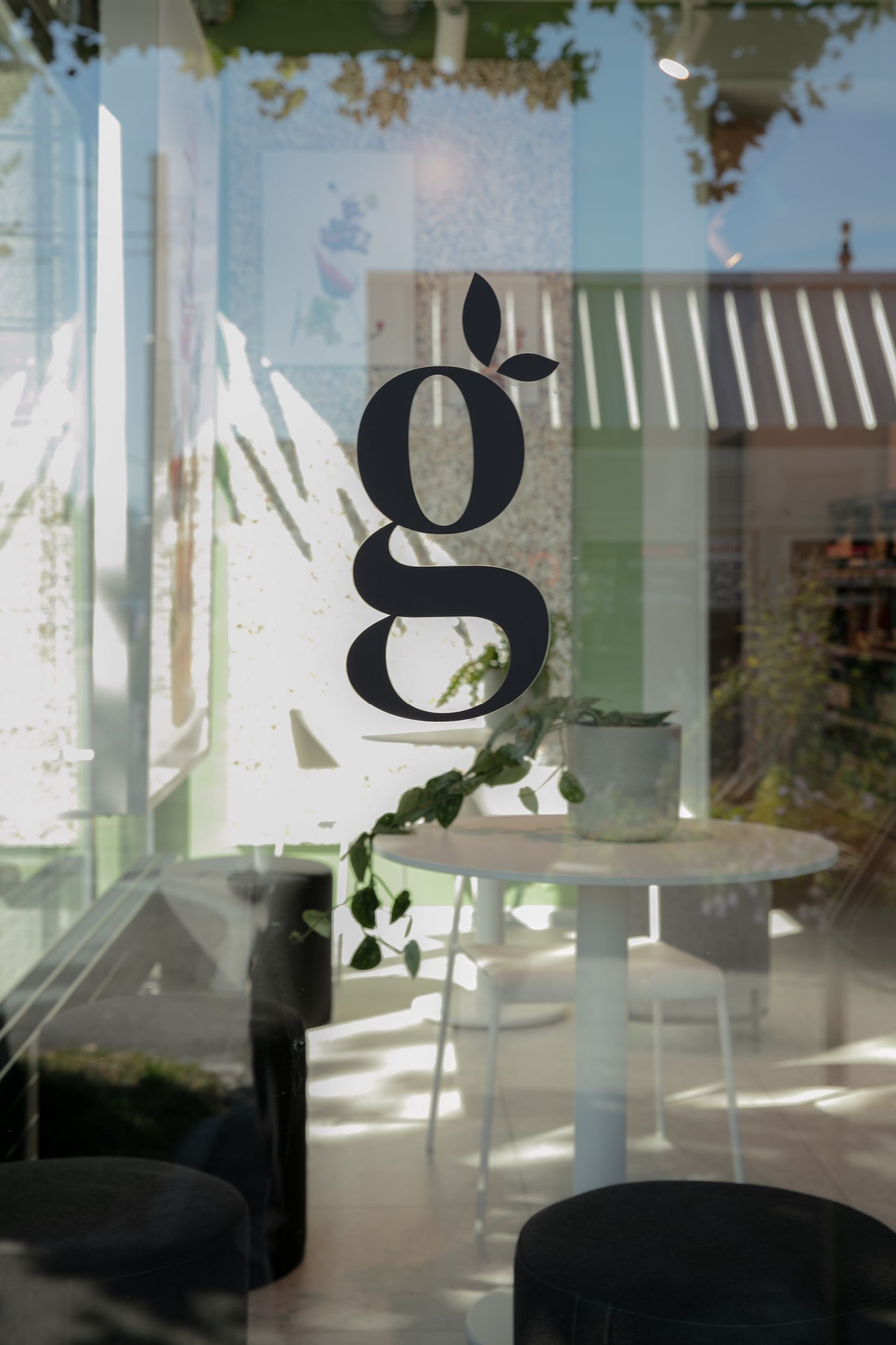
The idea for the naming was clear, to describe a carefully selected assortment of leader products, trendy brands and fresh handmade gooods. The minimal black and white branding concept puts the focus on the products and promises a comprehensive shopping experience with playful patterns and copywriting. The serif logotype is elegant, modern, and yet timeless. The dot at the end of the logo points out no compromise with the quality and freshness of the products. Inspired by the inner parts of fruits and vegetables, six unique patterns were designed to underline the store concept. They are extended to packaging, promotional materials like posters, in-store signage and interior furniture. The idea behind the image concept was to communicate the main product sections in the store by creatively piling the food on top of each other. In addition to creating the concept, Studio Frey also provided the art direction of the photoshoot and image editing. The modern web design gives a clear overview of the store concept, offered products and latest news.
Studio Frey has been working with migrolino AG in a long-term partnership, aiming to implement the same concept for their branding, packaging, signage and interior design in stores all over Switzerland.
2021
migrolino AG
Zurich
Brand Identity, Digital Design & Signage
www.gooods.ch

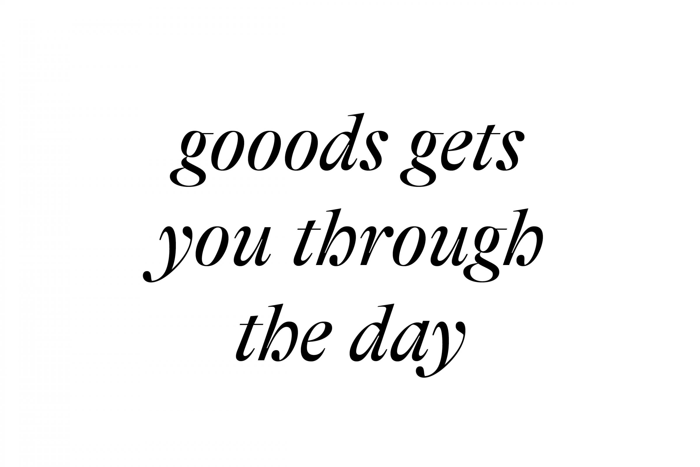
Together with our longtime partner the text agency The Communication Butler, we found an appealing and unique name for the new convenience store and created a playful text concept.
The first location in Zurich Tiefenbrunnen
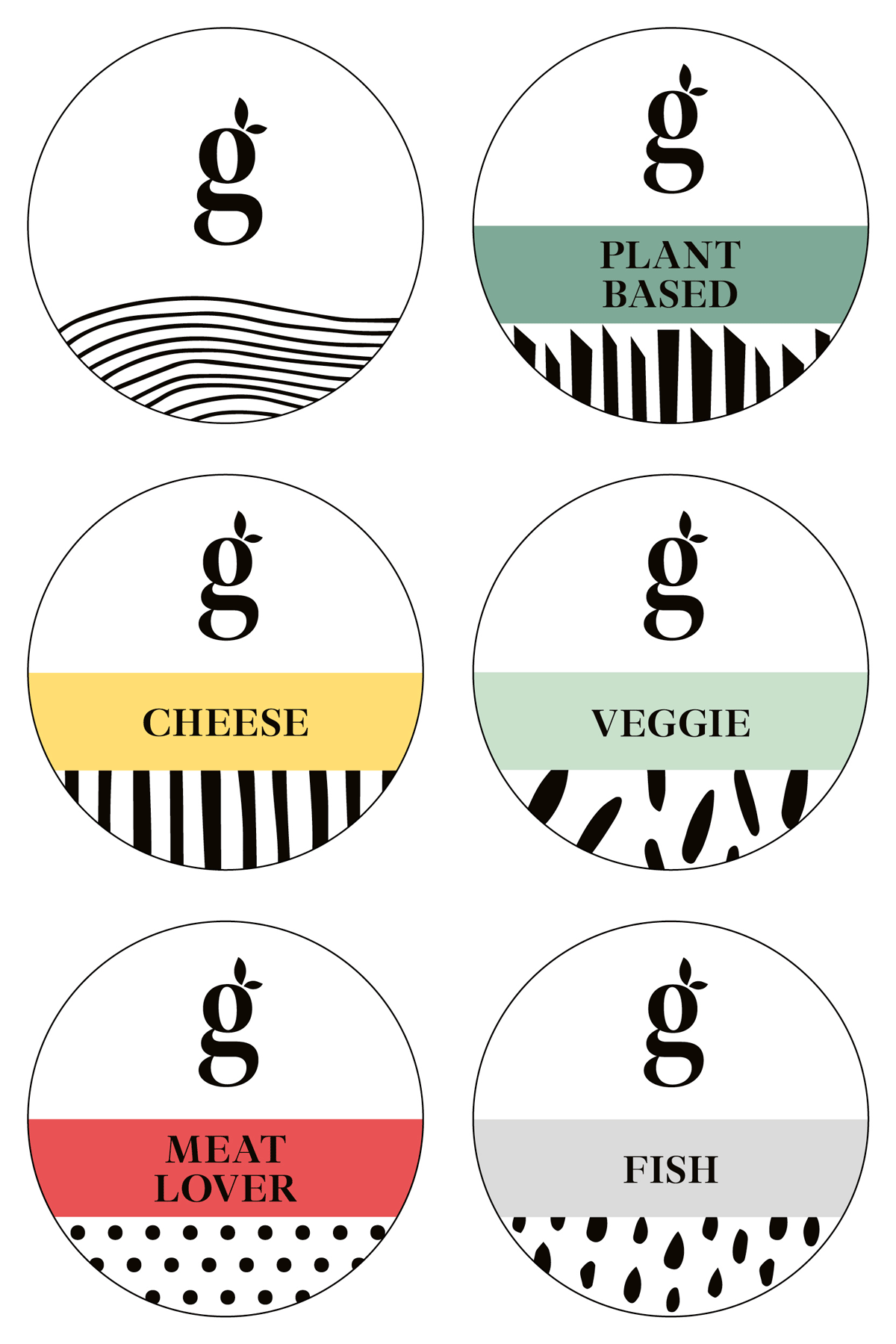
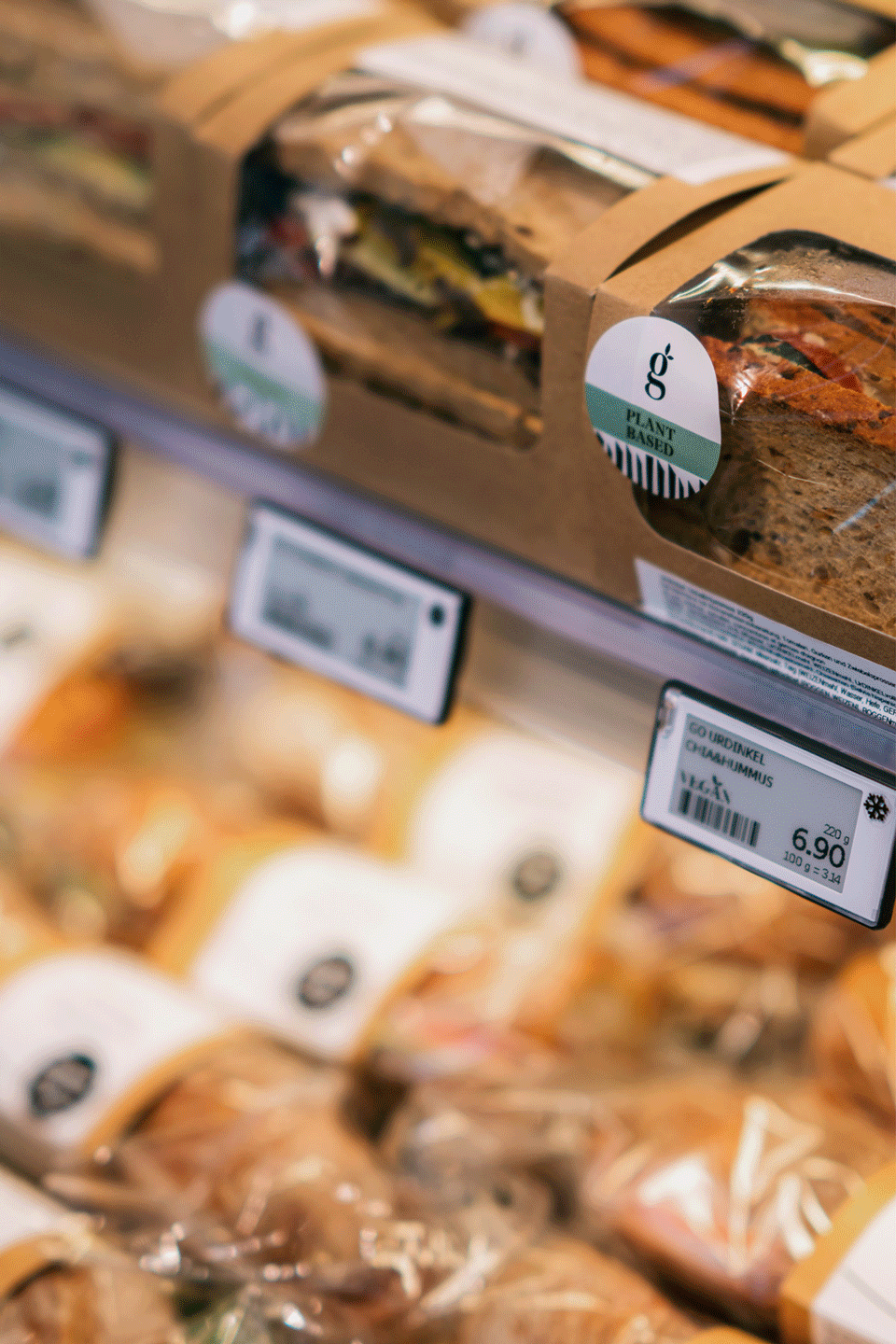
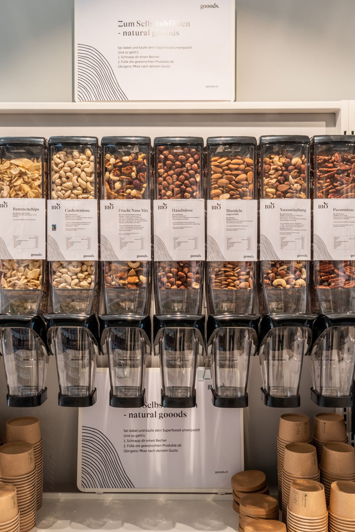
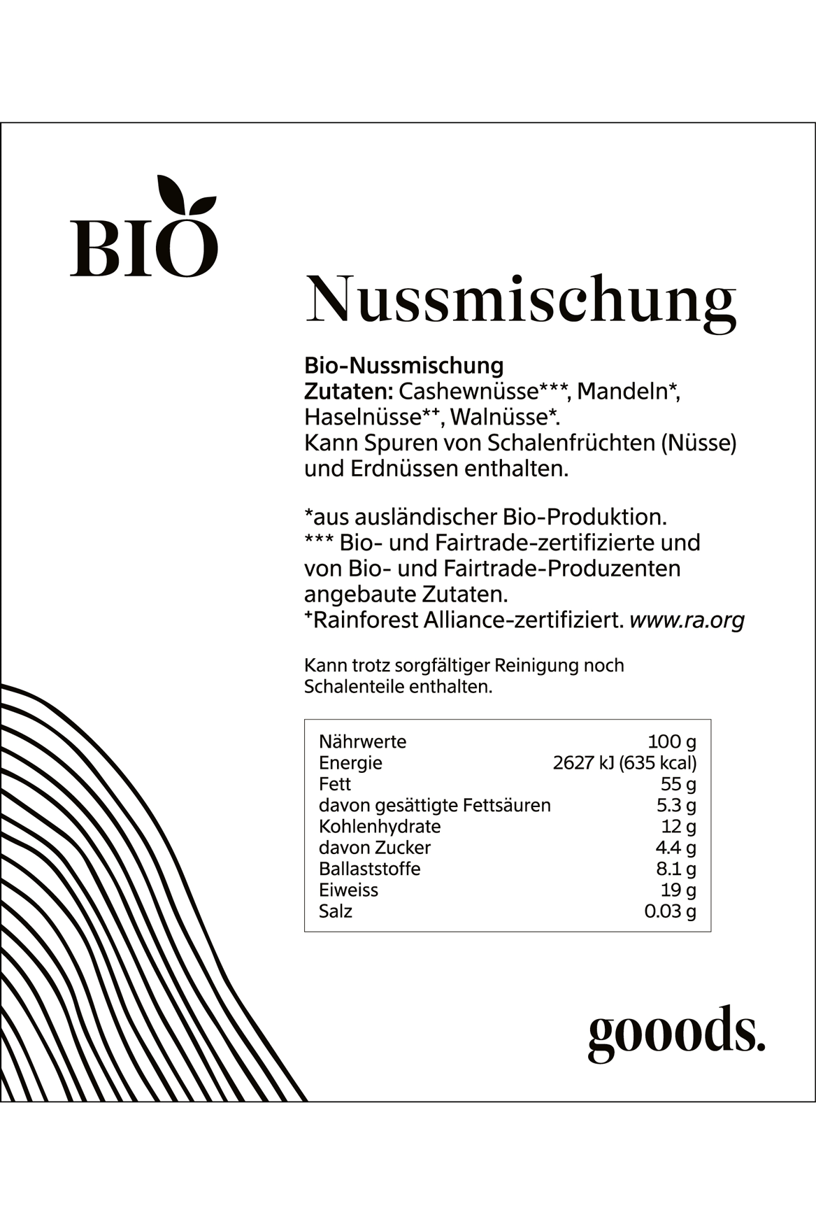
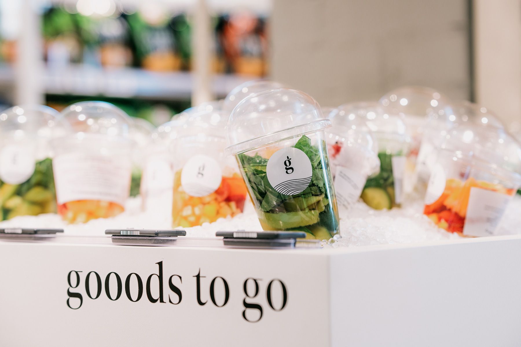
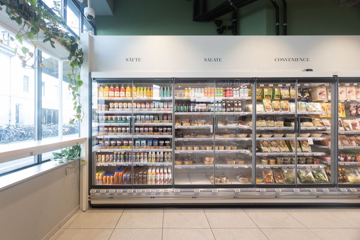
With the food packaging, we took a step back and let the freshness and quality of the products dominate. All freshly made products are marked with a minimal sticker containing brand elements on a white background.
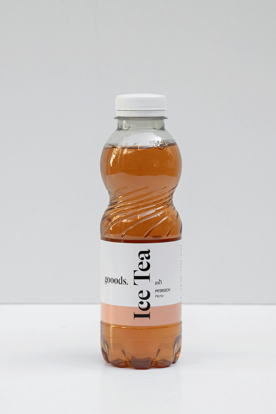
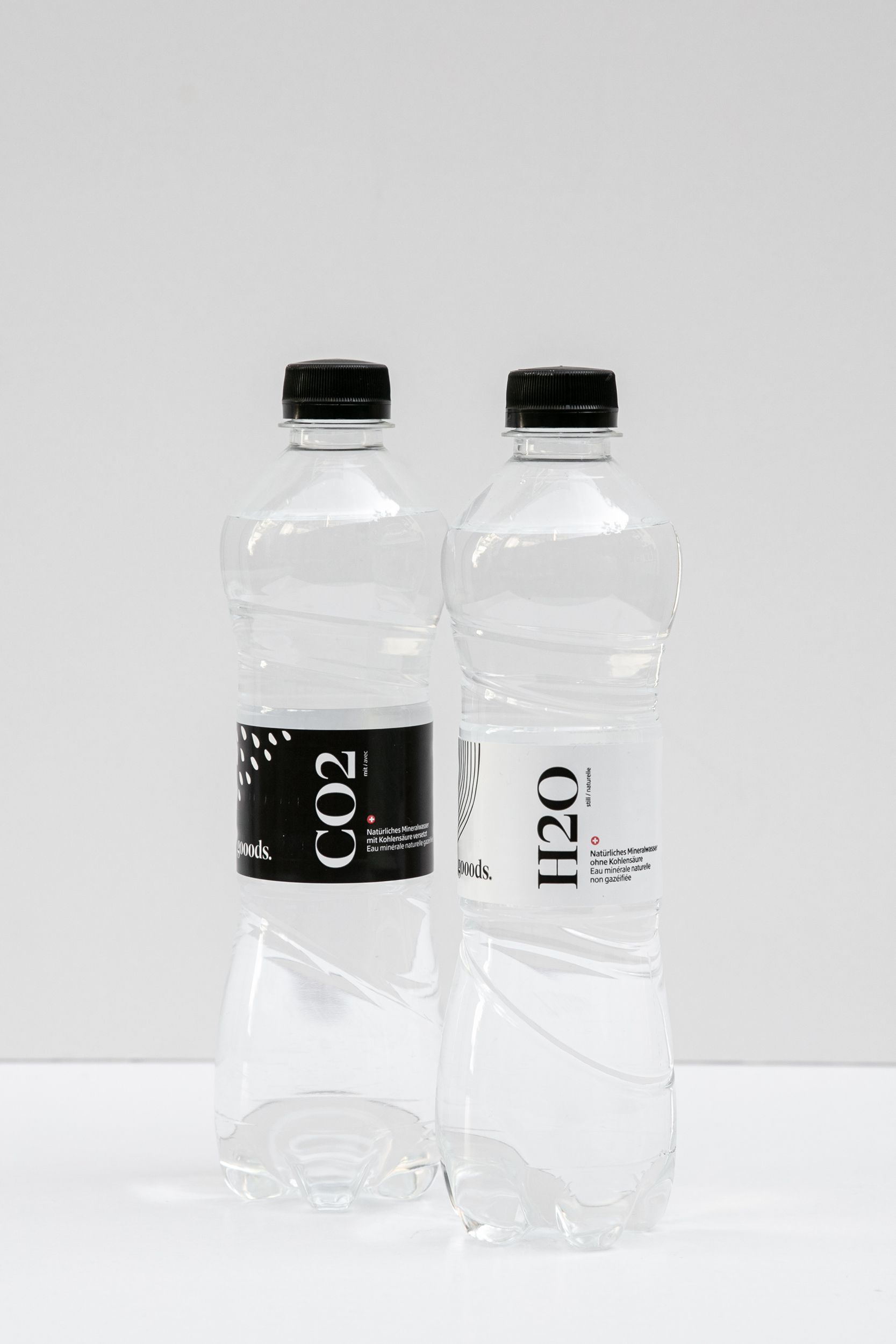
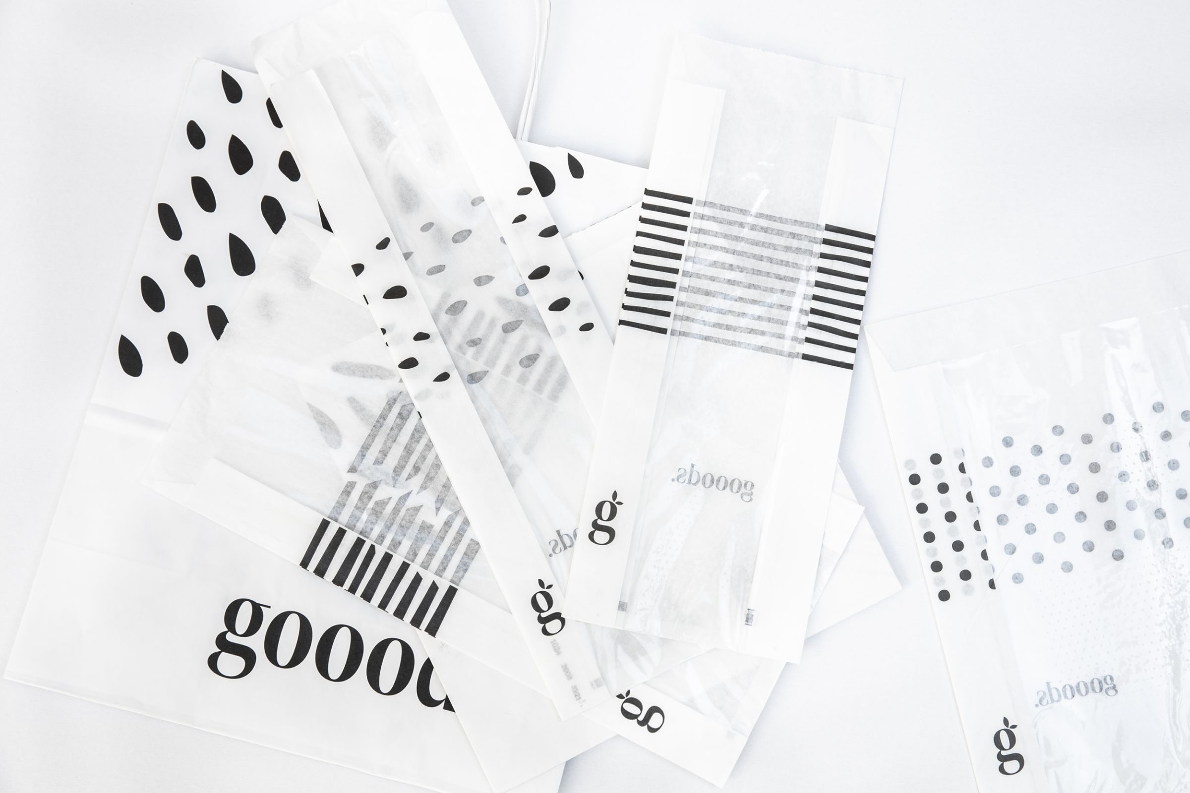
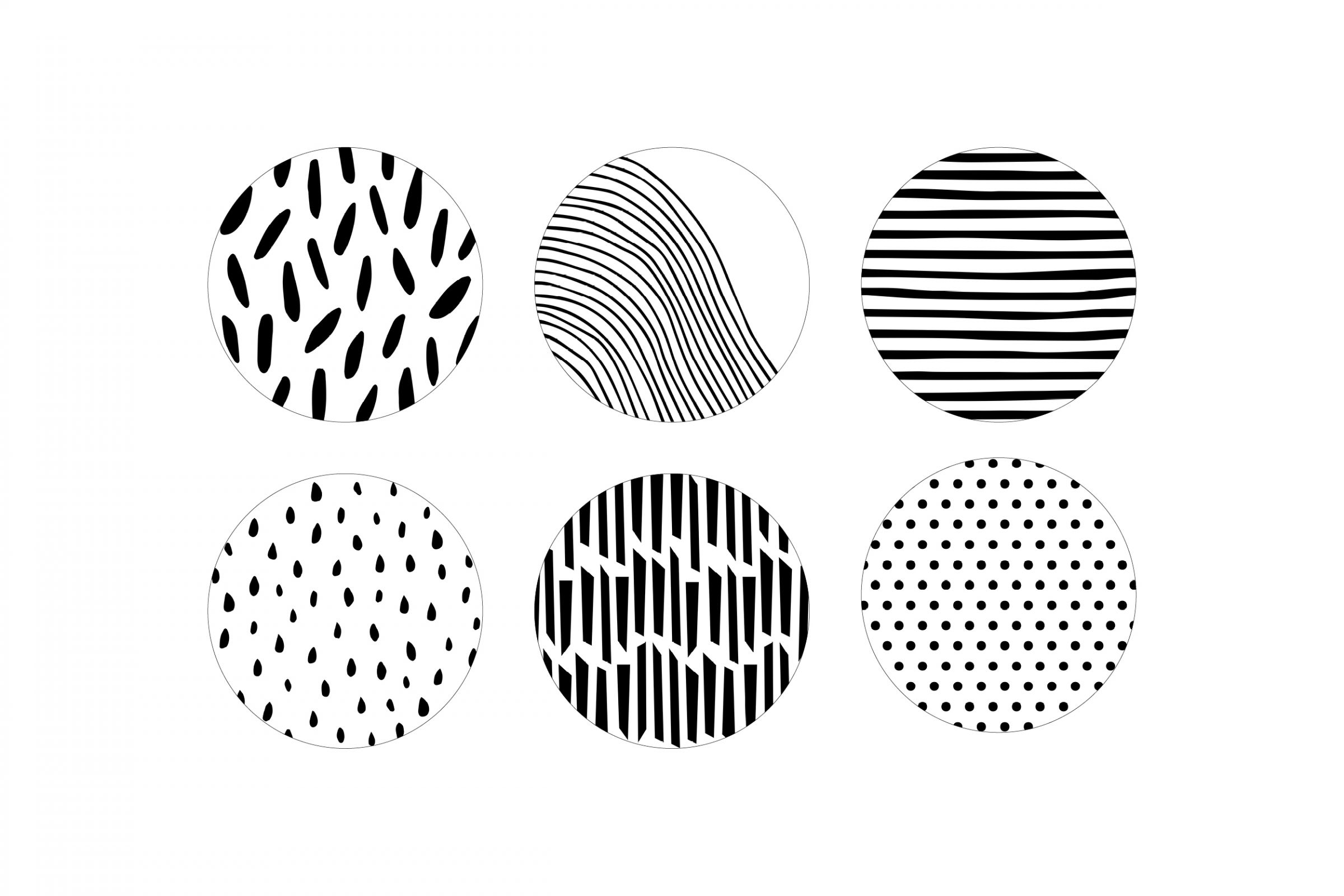
The patterns and graphic elements are abstract, organic and well recognisable. They are derived from the inner parts of fruits and vegetables.
The second location in Winterthur
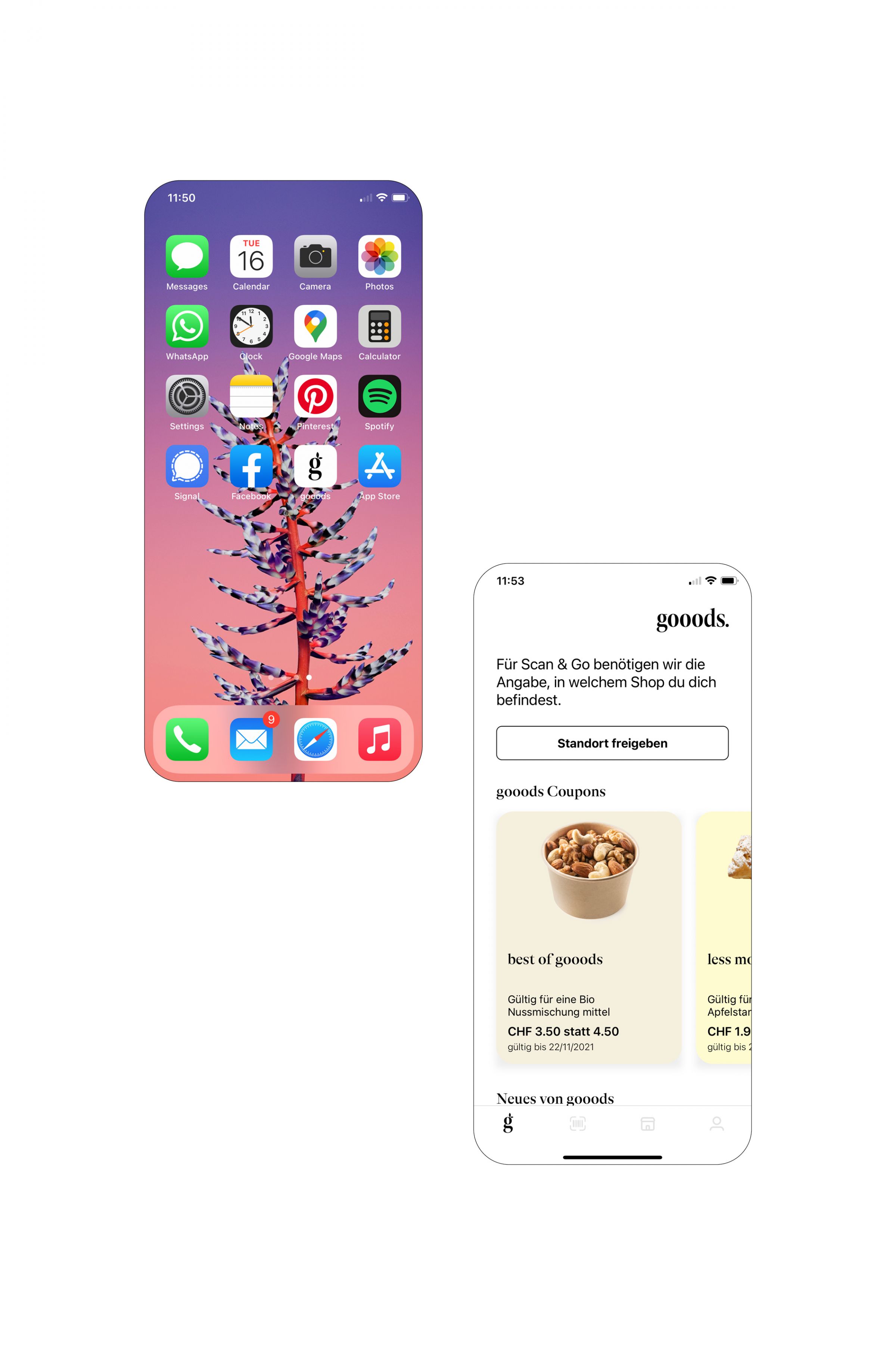
We supported the app developers in applying the gooods branding correctly and created a colour concept that allows employees to find the right background colour for each product.
We are delighted to be recognised and featured by DesignRush. Check out our profile.
Photography: Stephan Widmeier & Miles Butterworth
